

See where every credit goes. Before the bill arrives.
Cost analytics by warehouse, user, role, and query fingerprint. Five specialized query-analysis dashboards — spillage, errors, fingerprints, concurrency, performance — built on Snowflake's own query history.
Five dashboards, each built for a specific failure mode.
Generic "BI on top of ACCOUNT_USAGE" misses the patterns that actually drive cost and incidents. Each surface below targets a question your data platform team already asks weekly.
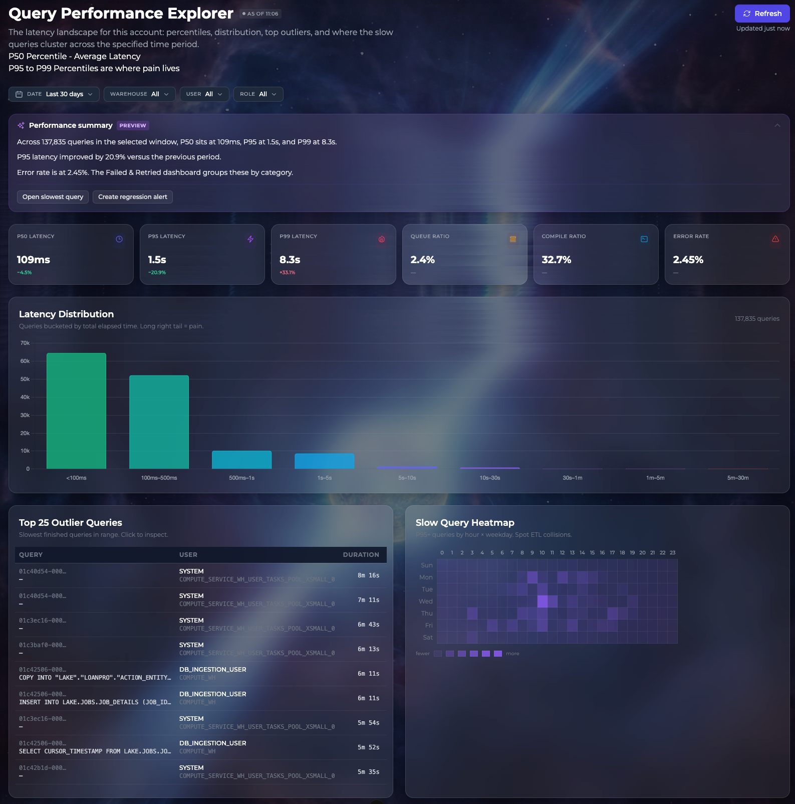
Performance
P50/P95/P99 latency, slowest queries, error rates by category, latency distribution.
Concurrency
Queue time, queue heatmap by warehouse and hour, top queue contributors by user and fingerprint.
Spillage
Local vs. remote spill totals, queries forced to disk, warehouse sizing recommendations.
Errors
Failed and retried queries grouped by category, with the SQL that failed.
Fingerprints
Query-shape clustering — find the one template costing 40% of your spend, not the one query.
Cost analytics
By warehouse, role, user, query fingerprint, hour, and day. Projected monthly spend.
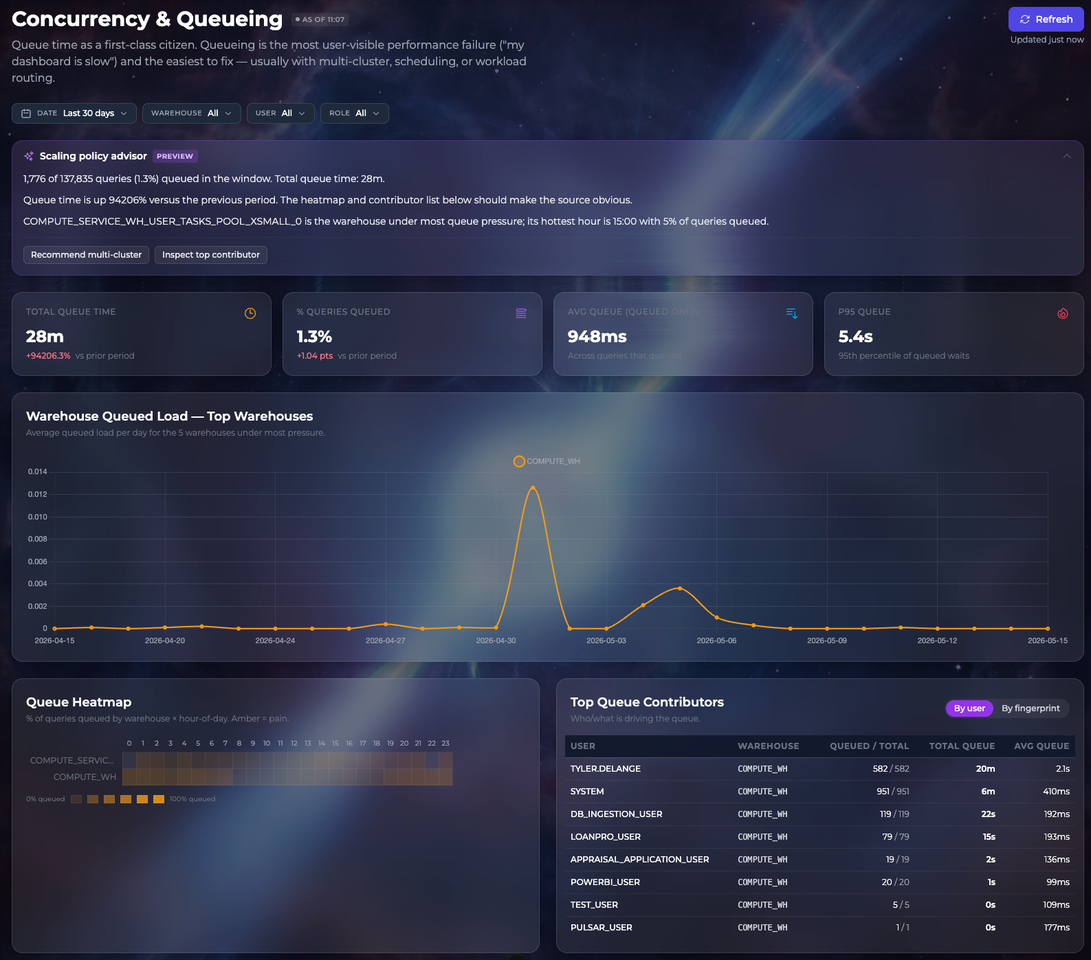
Find the warehouse that's queueing — and the user who's queueing it.
Queue time is the first user-visible performance failure (the "my dashboard is slow" complaint) and the easiest to fix — usually with multi-cluster, scheduling, or workload routing. PulsarAI surfaces both the warehouse-level signal and the contributor breakdown in one view, with a policy-advisor preview that tells you which change matters most.
Catch the cost spike before someone in Finance does.
PulsarAI watches each warehouse against its 14-day baseline. When a warehouse trends meaningfully above its normal-week pattern, it surfaces in your notifications tray with the σ-deviation, the contributing query fingerprints, and a one-click drill-through to the performance view.
See it on your warehouse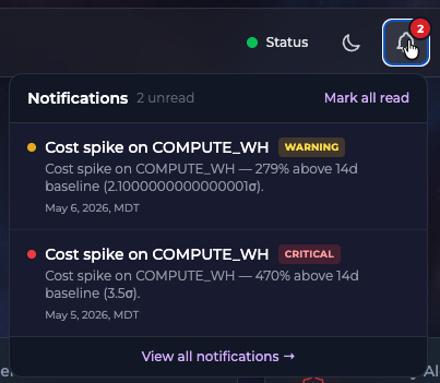
Stop paying for tools that pull your data out of Snowflake just to put it back.
15-minute read-only setup. Talk to the team about a 30-day evaluation on your real warehouse.